PLAYS GENESIS AND OTHER ORIGINAL STUFF
THE VISUAL CONCEPT
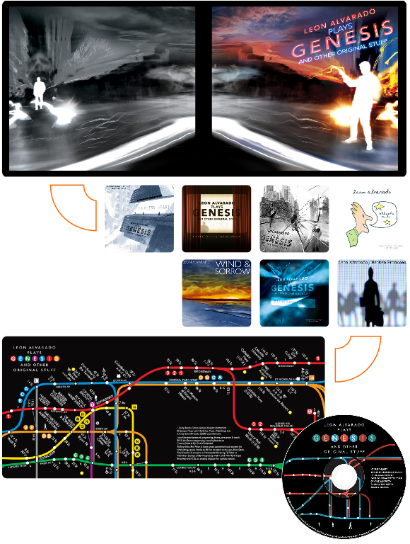
The concept for the album’s jacket is sort of a reincarnation of “The Lamb Lies Down On Broadway” seen from a visually different perspective. The front of the jacket depicts a conflicted man as he “detaches” from his current state of existence into a world void of color but full of strange people and odd creatures. It is the beginning of his story through a parallel reality, a place he built in his mind where escapism is the order for the day. The back cover for the jacket shows our man walking at ease through the streets of his newly found reality in complete understanding of his surroundings. He doesn’t seem to be bothered in the least even as the lamb lies down besides him and the specter from his past, disguised as a vapor-cloud, oozes slowly from the sidewalk steam beside him. In his story, he’s gone through it, he does understand, and he’s even living harmoniously within his entrapment.
BRINGING THE CONCEPT TO LIFE
The photograph for the CD jacket was taken in the middle of the intersection of Broadway and W 43rd St. on a busy September night. It was shot with a Leica using a four-second exposure. The result was a dynamic shot that showed movement through a series of blurred lights and the silhouettes of the crowd that gathers there at night. I wanted the album cover to have a New York reference since two out of the three GENESIS songs represented on it were from “The Lamb” album. I also wanted to blend the photography from color to black and white to reflect the juxtaposition of the original GENESIS material and my version of it. I wanted for the album cover to retain the visual quality that the music deserved. I added the “glowing man” character. Is more or less my vision of the character from “The Lamb” album cover but instead of being cut out of the background, my character is made out of pure light (a metaphor for the energy that drives our souls as human beings). On the back cover one could observe a strange and ominous face emerging from the “sidewalk steam,” and the lamb lying down to the left of our glowing character. All these elements are references to the origin of the material. The mirroring effect on the background images reflects the parallel “realities” in which the character finds himself. And no, I didn’t photograph a sheep laying down in the middle of Broadway Ave. It was a studio shot that was later added with Photoshop.